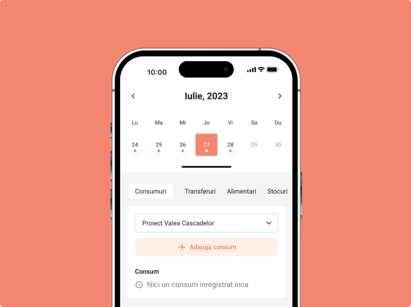
Office Management App
Industry
SaaS, Office Management
Duration
3 months (6 sprints)
Team
3 UX Designers
Skills
User interviews, Usability testing

The project aimed to streamline the office experience, improve efficiency, and ultimately boost satisfaction for both employees and managers. This is dedicated to companies with meeting spaces, optimises the management and reservation process, thus aiding in the rapid digitisation of the entire process.
The system is quite complex, having functionalities ranging from room statistics to office map & guidance, maintaining rooms booking up to date.
The goal and challenge was to identify the main friction points and propose improvements that would make the process more intuitive and reliable for all users. Also the process of booking and managing meeting reservations is inefficient and cumbersome, often requiring constant communication with a dedicated person for this activity.
Digitizing the process with significantly fewer steps and in a much shorter timeframe. This streamlined approach not only enhances efficiency but also accelerates the transition to a digitalized workflow, reducing complexity and increasing overall effectiveness.

The journey began with a thorough discovery process, where we uncovered the various challenges and limitations of the current reservation process. With this valuable insight, I set out to create a more efficient & user-friendly application that can significantly shorten the time required for this action.
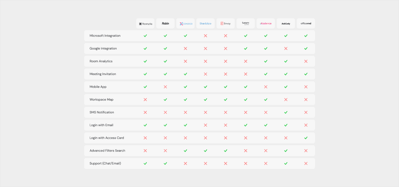
The app could be ensuring seamless integration with existing workplace technologies. As organizations may already have various software solutions and tools in place, the challenge lies in creating a smooth and efficient integration process.
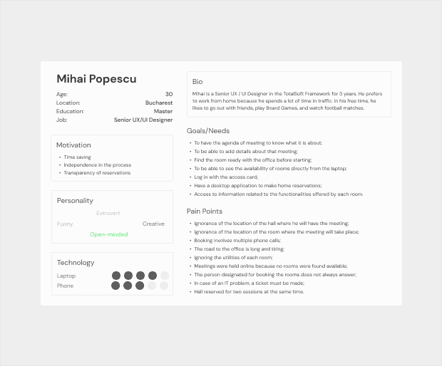
To better understand user needs, goals, and behaviour, we used several methods to extrapolate information relevant to the product.



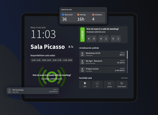
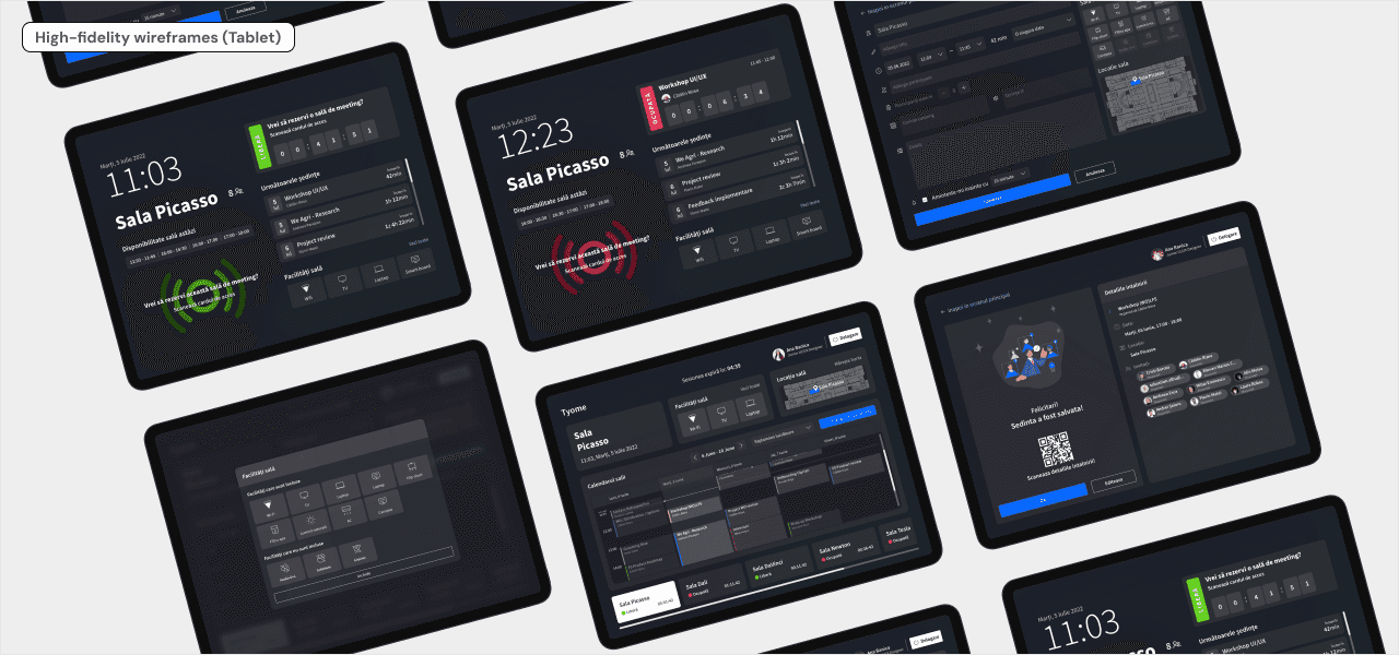
We came up with the solution to have tablets in front of each room with the application & a desktop application. The application should be customised according to the role that someone has in the company.
Also with the help of the application on the tablet, you can schedule meetings or reserve a room right in front of it, using only the access card.
By using green and red colors as indicators in front of each meeting room, you can easily see whether a meeting space is available or not.
And finally explored information architecture. It involves organising and structuring information to enhance usability. By designing the information architecture effectively, we can improve user experience and make information easier to navigate and understand.

Presented here is a series of screens from the app, intentionally avoiding complete flows to preserve the confidentiality of certain app features. My focus here is to provide a glimpse into the design without revealing all aspects of the app's functionality.


The solution has been well-received when presented. The solutions received positive feedback from our management, stakeholders and colleagues.
The solution was not implemented yet in the company, but we took the chance to explore different paths to take , experiment with ideas and gather feedback for the proposed solution for future implementation.