AndreaDinu.com
Industry
Coaching
Duration
3 months
Team
1 Product Designer, 1 PM, 1 Developer
Skills
Branding, Strategy, Product Design

Complete Life Redesign (CLR) is a proprietary life coaching methodology founded by Andrea Dinu — a former corporate problem-solver with 20 years of high-stakes consulting experience. The method is not generic self-help. It is a structured, documented system with named frameworks, diagnostic tools, and a defined client journey, designed to be scaled eventually as a licensed SaaS product.
I came onto this project as co-founder and lead UX/UI designer. Andrea and I are life partners — we lived through our own redesign together, years of travelling, rebuilding, and working out what actually matters — so I was not designing from a client brief alone. I understood the method from the inside. That changed every decision I made.
Life coaching is a saturated market full of vague language and visual clichés. The challenge for CLR was not just standing out visually — it was communicating a genuinely complex methodology to an audience that is sceptical by default and research-oriented by habit.
What we knew about the problem
The target audience (high-functioning, mid-career individuals) responds to specificity and documented process — not motivational copy
Generic coaching sites rely on personal celebrity; CLR needed to work independently of Andrea's name long-term
The market comparators (Tony Robbins, Mel Robbins, Steve Bartlett, Shirzad Chamine) are content platforms at their scale — CLR needed to establish brand authority first
The CLR method includes proprietary IP: the Truth Audit diagnostic, the Life Architecture Map, the 4 client archetypes — none of this existed online yet
Andrea's revenue target of $200K in year one required the site to convert serious, high-intent visitors — not casual browsers


The site launched as the foundation for a business in its early stages. The most honest account of results separates what was achieved architecturally and what still needs time and traffic to measure.

I approached research the same way the CLR method approaches personal redesign: understand the actual structure before deciding on form. That meant not starting with what a coaching website looks like — it meant starting with who visits it and why.
Research Methods
Competitive analysis — reviewed the digital presence of Tony Robbins, Mel Robbins, Steve Bartlett, Shirzad Chamine; identified visual patterns, content architecture, conversion flows
Audience profiling — mapped the 4 CLR archetypes (Andrea's proprietary personas) to site behaviour patterns: what they read, what makes them bounce, what earns their trust
Stakeholder interviews — extensive sessions with Andrea as both client and subject-matter expert; mapped every element of the CLR method to understand what the site needed to communicate
Content audit of the methodology — documented the full CLR IP: 6 pillars, Truth Audit tool, Life Architecture Map, 4 archetypes, programme structure, resource library

What the research told us
The target audience reads carefully — long-form content on methodology pages outperforms punchy copy in this niche; walls of bullet points signal shallow thinking
Proof beats claims — documented tools, real case studies, and named frameworks convert better than testimonials for high-ticket offers
The SaaS future requires a brand foundation independent of Andrea's name — the site architecture had to support this from day one
Navigation clarity is critical — this audience bounces fast if they can't locate what they're looking for within seconds
Resource libraries build long-term trust — a curated collection of tools and guides signals depth and positions the brand as a knowledge authority

Before wireframing, I mapped the primary user flows for the two most important visitor types: the prospective coaching client (evaluating whether to apply for the CLR programme) and the potential licensing partner (a coach or organisation evaluating the CLR method for their own use).
Primary flows mapped
Flow 1 — Discovery to application: Homepage → The Method → Work With Us → Programme page → Contact/Apply
Flow 2 — Story-led entry: Homepage → The Story → The Method → Work With Us
Flow 3 — Resource-first: Homepage → The Vault → resource download → email capture → nurture sequence
Flow 4 (next) — Licensing evaluation: Homepage → The Method → Licensing enquiry (not live at launch)
The design brief I set myself: sophisticated without being cold. Rigorous without being corporate. The CLR method is structured and demanding — but the people who go through it come out more human, not more systematised. The visual language had to carry both sides of that.
Design decisions I can account for
Restrained palette — no gradient sunrises, no motivational photography clichés; warm neutrals and deep navy signal seriousness without sterility
Strong typographic hierarchy — the methodology has layers; the type scale reflects that, guiding readers through depth without overwhelming them
Real photography over stock — where images appear, they reference real places and real moments from Andrea and Alin's story
No floating quote cards or emoji-heavy section headers — the audience for a $2,100 programme expects a different register
Component consistency — buttons, cards, section layouts follow a defined system so the site scales without design debt

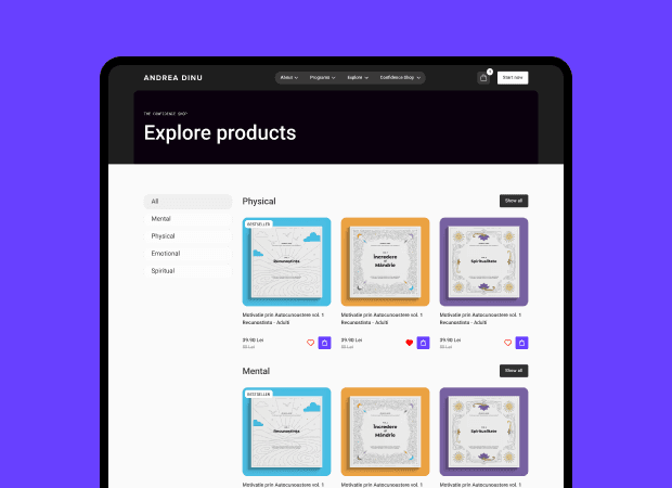
The site launched on WordPress with HubSpot landing pages handling programme registration. Below are the key screens from the final build.
Homepage
Opens with a clear positioning statement, moves into the method overview, ends with a direct CTA. No hero sliders, no animated counters, no stock photography of people looking pensively at mountains.
The Method Page
The intellectual core of the site. Covers the 6 CLR pillars, the Truth Audit diagnostic, the Life Architecture Map, and the four client archetypes. Long-form but structured — designed to reward the audience that reads carefully.
Mobile Experience
A significant share of the target audience encounters the site first on mobile. The design is fully responsive, preserving the same hierarchy and reading experience across screen sizes.